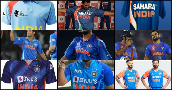
The ICC T20 World Cup is a spectacle of power hitting, acrobatic fielding, and pulsating finishes. But beyond the action on the field, another element captures the imagination of fans – the Indian cricket team’s jersey, that has gone through plenty of changes over every edition of the T20 World Cup.
Each edition of the tournament has seen a new iteration of the Men in Blue’s attire, reflecting design trends, sponsor influences, and perhaps even a hint of cricketing fortunes. Let’s embark on a nostalgic journey, tracing the evolution of India’s jersey through every T20 World Cup from the first edition in 2007 to the latest one in 2024.

2007: The Inaugural Edition (South Africa)
The inaugural T20 World Cup in 2007 saw a young Indian team, led by MS Dhoni, sporting a classic design. The jersey was a vibrant shade of blue, almost bordering on royal blue, with a subtle gradient effect. The sponsor logos were minimal, keeping the focus on the iconic BCCI logo and the number on the back. This jersey, paired with the same colour trousers, became synonymous with India’s spirited run to the final, where they ended up beating Pakistan.
2009: A Touch of Orange (England)
Two years later, in England, India’s jersey saw a subtle shift. The blue remained the dominant colour, but a hint of orange was introduced on the sleeves and collar. India’s long-time jersey sponsor Sahara was visible prominently on the sleeves of the 2009 Team India jersey. The jersey retained a clean and classic look, but the orange accent added a touch of vibrancy.
2010: Not Much of Changes (West Indies)
The 2010 edition in the Caribbean saw India retaining a very similar look to their 2009 jersey, especially considering there wasn’t a long gap between the two editions. The jersey was a straightforward blue with minimal embellishments. The sponsor logos were more prominent compared to 2007, reflecting the growing influence of commercial partnerships in the sport.
India’s T20 World Cup jerseys from 2007 to 2024. 🇮🇳
– Which is your favourite? pic.twitter.com/gpDYMFJtab
— Mufaddal Vohra (@mufaddal_vohra) May 7, 2024
2012: A Multi-Colour Splash (Sri Lanka)
The 2012 edition in Sri Lanka witnessed a more radical design change. The base colour remained blue, but a prominent stripe ran down the side of the jersey, with multiple colours including green, red, orange, and white. This design received mixed reactions from fans, with some finding it visually jarring. However, the jersey was very similar to the one India fielded for the 2011 ODI World Cup, where they beat Sri Lanka in the final.
SEE ALSO: List of top online sports betting websites
2014: Stripes and Sponsors (Bangladesh)
The 2014 T20 World Cup in Bangladesh saw a busier jersey design. The blue base was retained, but it was now accompanied by colourful designs across the shoulders on either side. The sponsor logos were more prominent than ever before, while the massive ‘INDIA’ across the chest stayed the same. While the functionality of the jersey remained uncompromised, the design choices seemed to prioritize aesthetics and brand visibility over a timeless look.
2016: A Return to Form (India)
The 2016 World Cup, held on home soil, saw India sporting a jersey that resonated well with fans. The design turned out to be well-received and the most eye-catching element was a reddish-orange design on the jersey’s right side. This pattern added a vibrant touch and set it apart from previous jerseys, a sentiment that resonated with fans yearning for a return to the team’s roots.
2021: A Throwback with Tech (UAE and Oman)
The 2021 edition, co-hosted by the UAE and Oman, witnessed a unique design choice. The jersey was a clear throwback to the iconic 1992 World Cup jersey, featuring a tri-colour panel across the chest. This design resonated deeply with fans, evoking a sense of nostalgia and reminding them of India’s rich cricketing heritage. Additionally, the jersey incorporated subtle technological advancements for better breathability and player comfort, including jersey sponsor Byju’s getting space above the ‘India’ wording.
2022: One Blue (Australia)
Nicknamed ‘One Blue’ due to the dominant blue theme, the jersey featured a gradient design, with a lighter shade of azure blue at the front fading into a darker royal blue on the sleeves. The darker blue subtly extended onto the torso area, which some saw as a nod to India’s past jersey styles. Pops of bright orange accents provided a burst of colour. These accents were on the buttons, collar, and the ‘INDIA’ inscription on the front.
2024: Fusing Tradition and Modernity (USA & West Indies)
The primary colour for India’s 2024 T20 World Cup jersey is a classic royal blue, a familiar sight for Indian cricket fans. Some vibrant accents are the twist that comes with the addition of orange sleeves, and an orange strip right down the sides as well. This orange adds a dynamic element and is a departure from recent all-blue jerseys. The collar incorporates the tricolour of the Indian flag, adding a patriotic touch. A white sponsor logo of ‘Dream11’ appears on top of the familiar orange ‘India’ wording.
Best T20Is world cup jersey?? pic.twitter.com/8d8yeC8LiD
— ً (@KohliMyHeart) May 29, 2024
For similar updates on cricket from around the globe, remember to always stay tuned to ReadScoops.com.
Sign-up to Betvisa and get 300 FREE cash + 5 free spins


